
Colour Magic
Clever colour selection can transform a living or work space instantly, making it calmer, lighter, cosier, bigger, more energising… paint colours are like magic.
However, choosing the right colours and colour combinations can be fraught with pitfalls and disappointment here are some of my hints and tips for exploring the world of paint colour.
Think about the MOOD and LOOK you want to create. Pale, cool colours make a room appear larger and airier and lighter whilst warm, dark colours create a more intimate, cosy atmosphere. Cool colours are calming whilst warm, bolder colours are energizing.
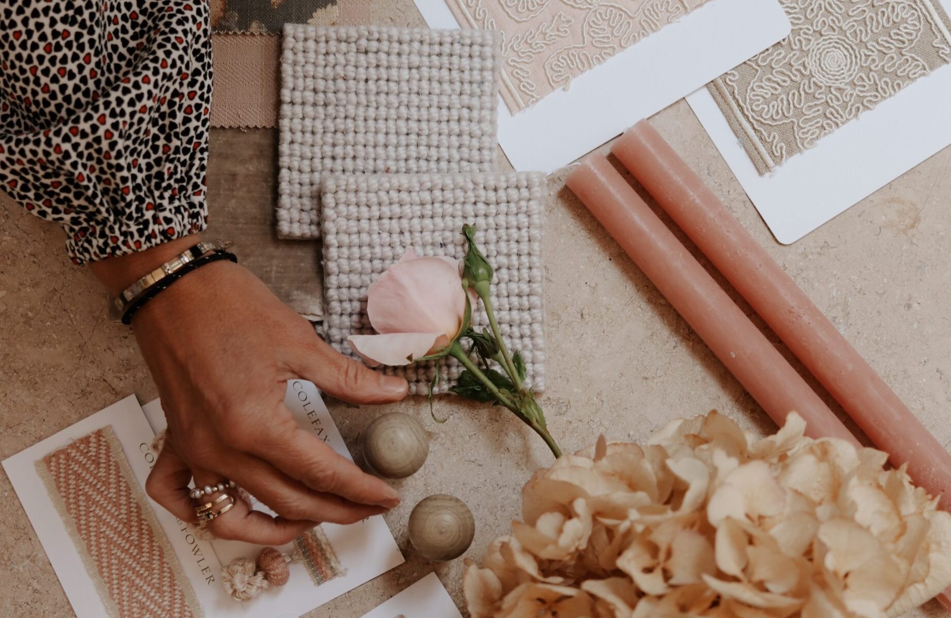
But how do you then pick the exact colours that will create the look you envisage? Do you have a favourite rug or picture already in the room? Do you want to use that colour as your starting point? Don’t try and match the colour exactly but rather look for a colour that blends with it and complements it. We’ve all been there. You think you’ve found the perfect colour yet it looks totally different once it’s on the walls. It’s really important to do your homework before it costs you in time and money. Paint a large patch of your potential colours on a piece of white card and hang the card on different walls in the room. Now note what the colour looks like at different times of day and in natural and artificial light. Does it still give the effect you wanted? It’s also important to think about undertones. These are the tones the paint will pick up depending on what the colour is next to. For instance, a white wall can look pink if next to a red rug. With some careful ‘rehearsal’ you can avoid disappointment when your room is completed.
Interior designers and others with experience have an ‘eye’ for colour and this sort of detail, but for most people it’s not so easy. What colours blend with what? Will this colour look cold rather than airy? We’ve all asked these questions. Major paint manufacturers research widely on new trends in interior design, furniture design and so on to ensure they offer on trend options alongside old favourites. You can really trust their blending suggestions and they know the importance of mood creating. Take Dulux for instance. Their 2019 range offers four key interior colour palettes which reflect this – THINK (Spaces for Calm), DREAM (Spaces for Succeeding), LOVE (Spaces for Sharing), and ACT (Spaces for Action). These and other companies are great sources of inspiration. Remember, bespoke colours can be mixed just for you at many outlets.

And finally, think about adjacent rooms. If you implement a complementary colour scheme throughout the whole house or work space, or throughout one floor, the whole space will flow in an aesthetically pleasing and balanced way which will have a hugely positive effect on how you and others feel as you move around.
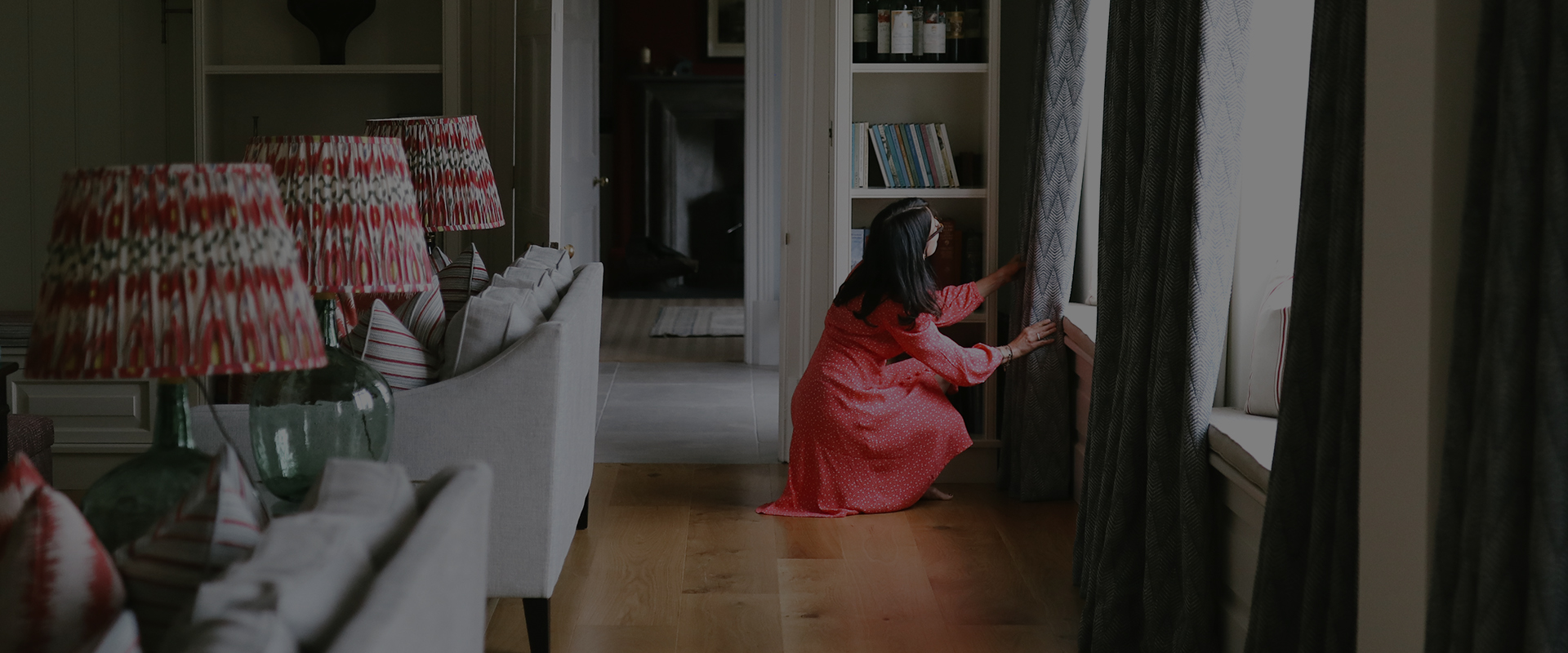
I love working with my clients, working with my ears to really LISTEN to what their vision is and with our eyes to SEE that vision and ensure they achieve it.
Colour is exciting, colour is transformational, colour is fun… Make your living or work space work for YOU.
Why not visit me in my showroom and we can start exploring this world of colour together?


Post a Comment
You must be logged in to post a comment.